Versatile and Cost-Efficient Logo Design
DESIGN
OVERVIEW
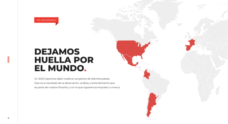
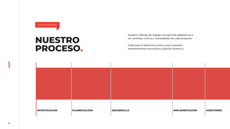
The logo design for Estudio 46 was developed as a modern, professional, and versatile representation of the brand, reflecting its innovative and dynamic approach. The project included not only the creation of the logo but also its comprehensive implementation across various graphic and digital materials, ensuring visual consistency and brand recognition at every touchpoint.
A simple color palette was chosen strategically to simplify printing and reduce costs for physical materials, while maintaining an attractive and memorable design. The logo was adapted for digital platforms such as the website, social media, and email communications, as well as physical materials including corporate presentations, official documents, business cards, banners, and more.
Key Achievements
Distinctive Design
The logo was crafted to highlight the unique essence of Estudio 46 with a modern and elegant approach, ensuring a strong visual impact across all platforms.
Strategic Color Palette
A minimalist color scheme was selected, optimizing for cost-efficient printing while maintaining an attractive and versatile aesthetic.
Versatility in Use
The logo was designed to be easily adaptable for both digital and physical applications, ensuring seamless integration into any format.
Digital Integration
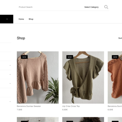
The logo was implemented on the website, social media platforms, and digital marketing materials, ensuring an optimized display on all devices and enhancing brand visibility.
Corporate Material Applications
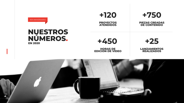
Custom applications of the logo were designed for use in professional materials such as presentations, official documents, and business cards to maintain a consistent and polished brand image.
Consistency in Visual Identity
A focus on maintaining uniformity in colors, typography, and graphic elements ensured a cohesive brand presence across all channels.
Scalability and Future Growth
A foundational brand identity guide was developed to streamline future projects, facilitating new applications and expansions while preserving the brand’s core identity.
