The design of miwebmola.es was born from a clear premise: proving that sobriety doesn’t have to be boring and that vibrant color doesn’t have to be chaotic. The goal was to create an interface that breathes creative professionalism, moving away from the generic templates that saturate the agency sector.
Instead of overwhelming the user with complex architecture and dozens of secondary pages, the design focuses on a fluid visual narrative. Every graphical element—from typography to white space—was meticulously placed to highlight the service’s value and guide the eye toward what truly matters: the digital solution for local businesses.
Key Achievements
Balanced Chromatic Identity
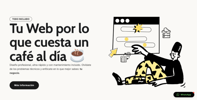
We developed a color palette with character but strict balance. Avoiding both cold, monochromatic minimalism and loud, «carnival-like» saturation. The result is a vibrant visual identity that ensures high brand recall without being overbearing.
Product-Centric UI
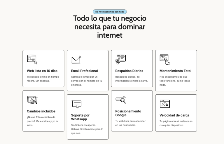
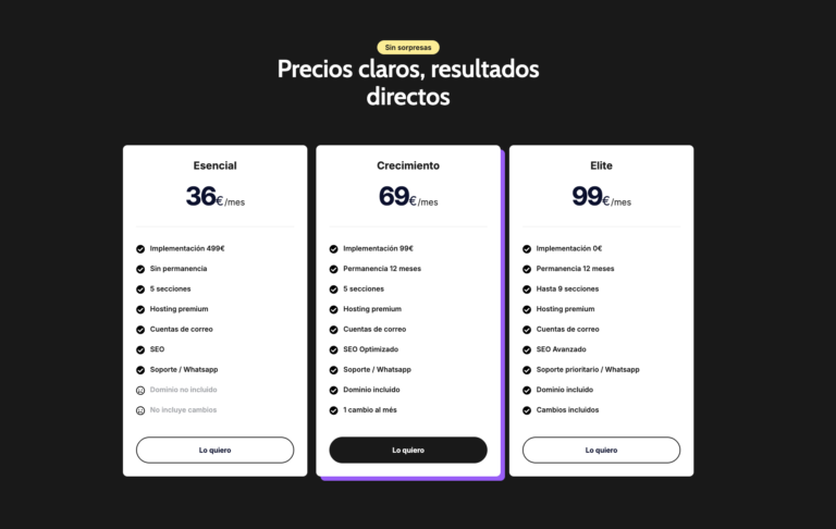
The interface displays services and pricing with total transparency and visual appeal. There is no «fine print» in the design; the UI communicates honesty and clarity, allowing the user to understand the offer in under 5 seconds.
Non-Intrusive Conversion UX
We engineered a user experience where CTAs (contact buttons and WhatsApp links) don’t «chase» the visitor. They are strategically and harmoniously integrated into the layout, allowing the user to convert naturally once the copy has built the necessary trust.
High-Performance Architecture
The design isn’t just beautiful; it’s efficient. The technical structure allows for near-instant loading times, eliminating visual friction or wait times that often penalize the mobile experience.
Functional & Aesthetic Simplicity
The project’s greatest achievement is its cleanliness. We stripped away unnecessary decorative elements so the user’s attention remains focused exclusively on the value proposition and the ease of hiring.